Learn how to choose the right photos for your website. With a few simple tips you can add the perfect picture to any of your pages.
Table of Contents
Did you know that about 80 percent of people remember the things they see, compared to only 20 percent of what they read? Photos can make or break your website. With great photos, you are able to captivate your visitors.
It’s no secret that visuals play a very important role in a website. Great photos result in increased engagement, a better-looking website, and a more trustworthy message.
But how do you choose photos for your website?
Finding the right photo is difficult. There are infinite options and sometimes you expect a photo to look great on your website but it doesn’t turn out that way. Or you know that a photo isn’t great but you can’t put your finger on why.
This tutorial gives guidelines on how to choose perfect photos for your website. What should you look out for? Or what do you ask for if you request a photographer to shoot photos for your website?
Choosing the best photo for your website is just as important as figuring out the right words. Great photos capture the attention of the visitor and tell a strong message in the blink of an eye.
How to choose the right photo
Choose the right composition
Photos on your website can be used for different purposes. The purpose determines the ideal composition. With composition, we mean the way elements in the photo are arranged and what the main focus is.
Let’s divide photos into two common types that you will usually see on websites:
Background photos (often in full-width)
Regular photos
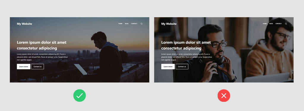
Let’s take a look at background photos first. If you want to use a photo as a background, it is important that the main focus of the photo is not disrupted by any layer above. See in the example below how the left photo balances text and focus point perfectly well, while the other one is a bit clumsy.
In the left example, the focus point (the man) is perfectly visible. But in the example at the right, the text overlays the main focus point.
Secondly, it is important to understand that each visitor will use a different device with a different screen size to visit your website. Some visitors use large desktop monitors to view your site while others have a tiny mobile device.
Although there are expections, background images are usually given to rows of content, in a rectangle shape. These are full-width and stretched across the entire screen. Some photos don’t handle that very well on large screens.
Think about how your background photos will scale across big and small screens and make sure to choose photos that offer enough flexibility. Usually, it helps to go with photos in landscape orientation – not portrait – and to avoid close-up photos.
This will give you enough flexibility and space to play around and to find a perfect alignment for your background image.
For background images on wide screens, you have more flexibility and space with landscape orientation compared to portrait orientation, as well as no close-up photos.
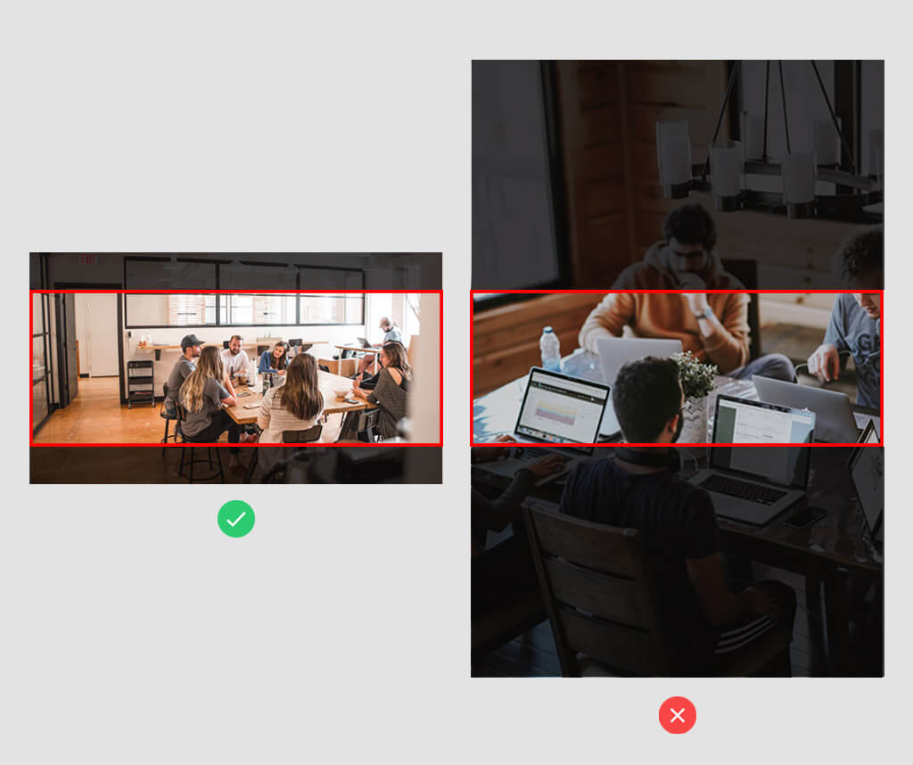
Another important aspect of Composition relates to visual guidance. If the Focus Object in a photo is a human, this person should look toward your content. If that is not the case, your visitor’s attention will naturally shift away from your main content.
If we see a human face, we look where they are looking.
If you found a perfect image but the person in the photo is looking the ‘wrong’ way, you can use an online tool, such as PineTools, to flip the image.
With this trick, you can strategically direct your user’s attention to a part of your website.
Keep your visitor's attention focused on the page. In the example at the right, your visitor tends to naturally look away from your content.
Only use high-quality photos
Make sure that the photos you select are of high quality. Lots of people try to take their own pictures with their phones or camera. Although this might work, don’t estimate what additional value a professional photographer can bring. High-quality photos mean that they should look as if they were made by a professional photographer with a quality camera.
High-quality photos also mean that each photo on your website should have the right size. Don’t upload raw camera photos to your website because it could make your website slow to load. But also, don’t upload tiny photos if you use them as large background images or they will end up blurry.
In general, we recommend uploading photos with the following widths:
Header and full-width background images: 1920 pixels
Blog post images: 1200 pixels
Smaller images within a multi-column layout: 600 pixels
We recommend uploading photos in JPG format. This has a smaller file size than PNG while still maintaining good quality.
Don’t forget to compress images on your website too. This will make loading times much faster. You can use TinyPNG for this, but even easier is an automated plugin that automatically compresses every new image you’ll upload.
ShortPixel is a great plugin for image compression. Sign up for their free plan, install the plugin, and it will always run in the background.
Go for originality and authenticity
Provide your website visitors with images they can relate to. Photos that are original and authentic and which appear to be shot exactly for your website are perfect.
Of course, a large header photo requires even more attention to originality and authenticity than a smaller photo further down your page. But preferably all photos on your site should be spot-on.
Originality: Your website has a specific message to tell. Select photos that appear to be made for your website. Don’t choose photos just because they are beautiful. Choose photos because they are a great fit for your website and content. The more generic a photo feels the less value it brings to your website.
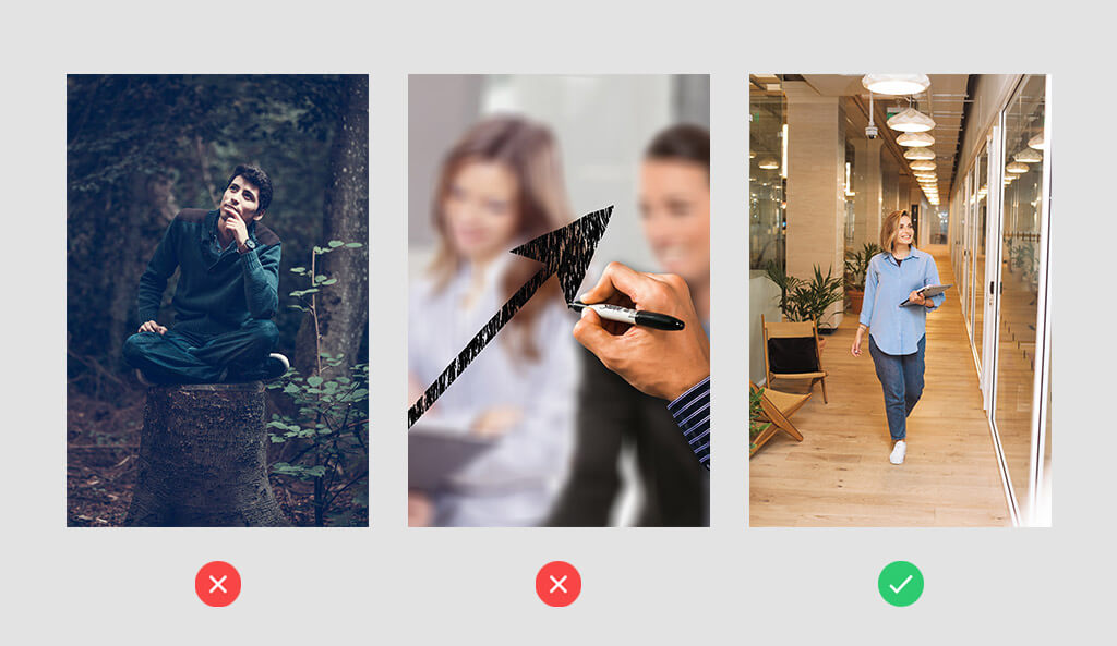
Authenticity: Authentic photos look like real-life situations that your visitors can relate to. Avoid photos that feel unreal, staged, or where people pose unnaturally.
Have you ever seen a man sitting on a trunk in the forest like that? Or an arrow being drawn on a window so perfectly? Choose photos that feel original and authentic instead.
Show people and faces
Showing a photo with faces is an effective way to get attention. Research has shown that people are attracted toward faces. It makes your website feel trustworthy, authentic, and welcoming. This is especially true with faces looking directly at the camera. This will have more emotional impact on your visitors.
People tend to like seeing other humans, especially if they are similar to them. For an even bigger impact, choose photos of humans in settings where your visitors can relate to.
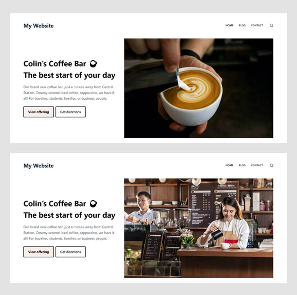
In the example below, you see two header images for a coffee bar website. In the first example, we show a barista ‘in action’. This gives at least a human touch, and it’s better than showing just a cup of coffee on a table. In the second photo, we show a barista in action too, but now with faces in a recognizable setting where your visitor can relate to.
Photos with a human touch, especially with faces, make more impact than photos with just objects.
Use photos that reinforce your message
Most visitors to your website don’t spend much time reading. Humans process images about 60,000 times faster than text. A photo speaks a thousand words. So ideally every photo reinforces your core message and expresses a call to action.
In the end, it comes down to choosing originality and authenticity, as mentioned before. The better your photo blends in with the rest of your website and is tailored toward your audience, the stronger and clearer the overall message will be.
Adding to this, you can leverage the synergy of text and images. Text and images don’t stand alone but they are related to each other. Make sure that photos support your website’s goal and are relevant to the text surrounding it. Strong composition gets your point across and pushes visitors into a certain action.
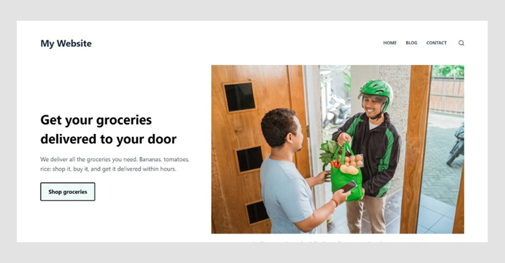
The photo clearly gets the main point across: get your groceries delivered to your door.
Beware of metaphors
It can be difficult to always find a fitting photo. What image do you show next to a contact form? Or what image do you show on a website of a new psychology company?
It can be tempting to start thinking in metaphors. Next to your contact form, you might consider a photo of an English telephone booth. Or for a life coaching website, you might consider an image of a compass.
However, be careful of using too many metaphorical photos. It can make your website feel impersonal and generic. Some metaphors are very subjective too. Its meaning can be clear to you, but not so clear to other people.
Make sure that metaphorical images make sense to all visitors who might visit your website. And if you choose metaphorical images because you can’t find better alternatives, consider removing the photo altogether (illustrations or a video could be an alternative instead).
Keep your style consistent
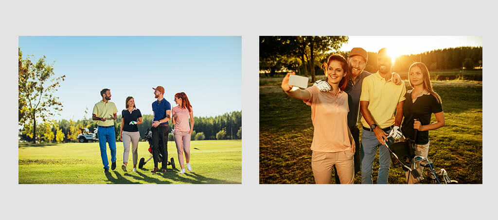
Every business has its own unique look and feel and your website usually builds on this style. It exists of elements such as recurring colors and a set of typographic styles. Photos also come in different styles. They can be light or dark, colored or black-white, colorful and saturated or not, shot during day or night, and so on. Make sure photos fit well in the overall style of your business and website.
The same people on the same golf course but in different styles. The left photo has a lighter and more natural style. The right photo is darker with a strong vignette and shadows.
Conclusion
We can’t underestimate the impact of great photos on a website. However, choosing the right photos can be a challenge. It could take as much time to find a great photo as to write stellar content next to it.
This guide gave a couple of tips and tricks to choose the best photos for your website. It all starts with carefully thinking about what message the photo should convey. What is the purpose of the particular photo you are looking for?
With that goal in mind, you can search for the right photo. There are many online stock photo sites available, but hiring a photographer is even better. Look for original, authentic, and high-quality photos. Think about how you can make your visitors feel most welcome and relatable.
Finding the right photos can take a lot of time, but the effort pays off. A great photo makes your website much stronger. A collection of great photos takes your website to even a whole other level.
Be aware of licensingIf you can't use your own photos, you can get photos from free or paid stock photo sites. Be careful of photos that you obtain from the internet. Those images are offered under so-called copyright licenses. Licenses that you will often find are Creative Commons or Public Domain. Each license comes with different limitations and requirements. Make sure you use reliable stock photo websites and carefully check their licenses before you include photos on your website.
3 Responses
I didn’t realize that choosing the right photos for the website is so important. Thanks for the tips, I will apply them in my las vegas seo company.
Choosing the right photo for a website has always been a nightmare for me. I know that it is important even in the context of local seo, so I would like it to be easier for me. I will try your advice and hope it helps 🙂

3 Responses
I didn’t realize that choosing the right photos for the website is so important. Thanks for the tips, I will apply them in my las vegas seo company.
Happy we could help and looking forward to see how it will improve your website 🙂
Choosing the right photo for a website has always been a nightmare for me. I know that it is important even in the context of local seo, so I would like it to be easier for me. I will try your advice and hope it helps 🙂