
What is UX Design?
Websites can serve many purposes. They can be used to explain your business, publish blogs, sell a product, host your podcast – the possibilities are endless. But whatever you do, to be successful it needs to work not for you, but for your visitors. In other words: your website should have a great user experience (UX). But how do you design great UX?
Great UX is not a fixed list of elements that you can tick off. UX is a concept that has multiple dimensions. It refers to the overall experience a user has while interacting with your website. It is about the visitor’s perception of utility, ease of use, and efficiency.
With good UX, you will add value to your users. You approach them in the way they want to be approached. You help them accomplish their goals. However, this is only possible through a holistic approach. An approach that touches upon all elements on your site; all to be designed in a consistent and usable way. With the user in mind. Think about:
- The visual style of your website (accessible colors, clear typography, …)
- Information architecture (how are pages structured, how is content presented, …)
- The components on your page (clear call to actions, logical forms, …)
- Speed and performance
Great UX is not just a bonus for your website or a necessary evil. If you put the user at the center while building your website, you can create a fantastic effective website that performs beyond expectations!
If you think good design is expensive, you should look at the cost of bad design.
– Ralf Speth
UX Design for WordPress
In fact, UX Design is not something that applies specifically to websites, or to WordPress websites for that matter. UX Design is a mindset that applies to every product or service that you will ever use or build, no matter what it is or how it is made.
However, WordPress comes in a certain form. It is a piece of software designed in a specific way. We know how WordPress websites are usually developed and have seen common pitfalls and challenges with them. Therefore, we can tailor a few design principles and best practices more specifically to WordPress.
This guide helps you to design better UX with WordPress. It explains how to build user-friendly websites with WordPress, how to solve common WordPress-related UX issues, and how to consistently improve your website along the way.
It is important to realize that User Experience Design is never finished. A great UX is based on actual user research. The tips in this guide are a starting point but your most valuable insights will come from real conversations with your (potential) visitors.
Do you want to learn more about the general principles of UX Design? Click the box below to see a few links to great UX resources.
Learn more about the basic principles of UX:
- What You Should Know About User Experience Design (Adobe)
- What is UX Design? (📹 video by CareerFoundry)
- 15 UX Experts about what UX Design is (User Testing.com)
3 design principles for WordPress
Great UX all starts with having the user at the center of your website. Your visitors can tell you the very best what they expect to find on your website.
In the process of building your website, there are three design principles that are in particular important when designing for WordPress.
1. Design for mobile
Did you know about two-thirds of all web traffic comes from mobile?
Unfortunately, most people design websites in the first place for desktops. It’s logical: you design and build websites on a desktop computer, so you tend to look at the desktop design first. However, make sure you design for mobile-first. Optimize your site for small devices.
Just making your website responsive is not enough to consider it mobile-optimized. Designing for mobile brings additional challenges. On average, people visit fewer pages on mobile and they tend to leave your site within 3 seconds if it doesn’t load fast enough. Test what you build on mobile devices and desktops and check if everything works well on both.
2. Design with consistency
WordPress is an extremely flexible platform. You can design and adapt your website exactly the way you want. Unfortunately, this makes it easy to try out new things across your website. Your site, however, is a holistic experience and should feel unified.
Settle for a style that you like and stick to it. Don’t switch styles on some of your pages because you want to try out something nice. Be consistent in color schemes, header design, content placement, backgrounds, and photographic styles across all your pages.
3. Less is more
Every popular WordPress theme prides itself on endless customizations and dozens of great features. And on top of that, did you know there are over 55,000 plugins for WordPress in the plugin library? Those add great features to any WordPress site.
It is tempting to bomb your visitor with all these features and functionality. Unfortunately, users don’t care about it. The only thing they want is the information they are looking for, presented in a clear and concise way. Before you add a new feature, decide if it really supports the goal of the user. If not, don’t add it. Less is more.
13 tips to improve your UX
1. Plan before building
Designing websites is fun. So much fun that it is easy to start designing and building right away. However, if you don’t take a step back first, you greatly risk building the wrong things or building something that doesn’t work out as imagined. That’s a pity to realize after putting in a lot of effort.
Make sure to do the following two things before you build or extend your website:
Before you build your website, it is easy to already have a clear plan in mind. You decided on the content, how it will look like, and how you will promote your product or service. These ideas are often based on your own opinions. Best case, you discussed it with a friend or two.
Your audience, though, will always respond in unexpected ways. They might look for something you never thought about. They might need information that you didn’t include in your original plan.
Always talk with a few people who are part of your expected audience before you build your website. This can be in-person, over the phone, in a video chat, or through a survey.
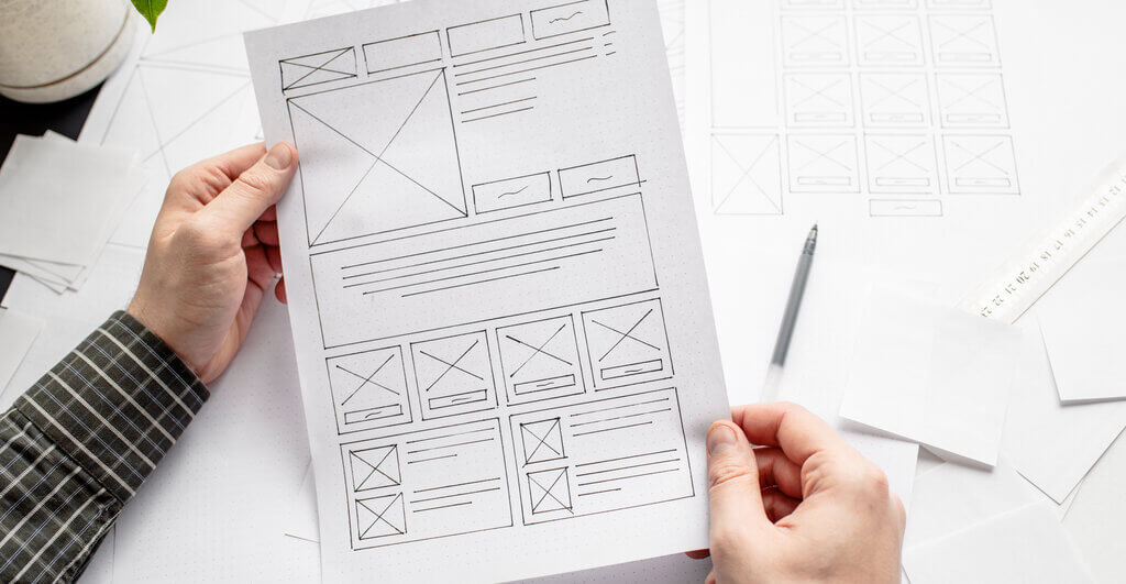
A plan can look great on paper or in your head. But when you sketch it out, it can suddenly uncover new or missed opportunities.
Before you start to build your website, make rough sketches of how your website will look like. Sketch quick wireframes and write down where you will put content and buttons and to which pages those buttons will refer.
2. Chunk content into smaller paragraphs
A website is very personal. You are passionate about the topic, so it is tempting to write a lot of content. Unfortunately, this usually doesn’t work. Think about a few recent websites you visited. Did you often spend more than a few seconds per page?
Web visitors have a very short attention span. They expect your site to load in under 3 seconds and then they have an 8-seconds attention span to scroll through a page. Eight seconds. This is extremely short. Users want to scan your website fast and move on.
Although there are certainly cases where extensive content is great (for example, if you are writing a blog item), the typical personal or corporate website page doesn’t need it. Break up your content into small paragraphs with headings and lists to avoid content overload and facilitate fast content scanning.
3. Use icons and lists
As said in the previous point, your visitors have such a short attention span that the presentation of your content should be optimized for easy scanning. There are multiple ways to make your content easy to digest.
The previous step was about chunking your content into smaller paragraphs. Using icon boxes & lists is another great way to structure your content and make it concise.
4. Be careful with hover effects
Hover effects add dynamics to your website. Think about a button that lights up while hovering it with your mouse. Another common element with hover effects in WordPress is Flip Boxes. You hover your mouse over a block and you see new content appear (see below for an example).
However, hover effects are not very effective on mobile phones. On mobile, you don’t have a mouse; you have a finger. And hovering something with your finger doesn’t work; you have to literally tap to activate the hover effect.
Be careful with hover effects. They add interesting dynamics but don’t rely on them to show content. You will risk mobile users not seeing it. If you still want to use those, be at least clear to the user that they should tap to see more info.
This is a title
5. Don't overdo animations
Some themes add animations to every element on your website. Although it could give the impression that your website is more immersive, make sure to not overuse them.
Only use animations where they make sense and serve a clear purpose. Don’t distract your users. Keep animations natural and simplistic. For example, don’t let large areas of text slide in and be very limited with parallax effects and scroll-based animations.
Places where animations do work are:
- An effect while hovering on an interactive element (such as a button)
- A dropdown animation for your submenu
- A loading animation
- A rotating carousel
Don’t overdo animations. Only use them if they actually make sense.
6. Make interactive elements stand out
Interactive elements are essential to your website. Buttons, links, carousels, and forms make your website dynamic and guide your users toward their goals.
Make sure that interactive elements stand out. It should be clear to your user where they can click and what will happen.
For buttons, you could add distinctive colors and rounded corners to separate them from regular content. Make sure to only use those colors on interactive elements so it’s clear to your users what they can interact with. For inline links, highlight those through a different color or underline (like this). For carousels and header sliders, add navigational arrows.
7. Only use a hamburger menu for mobile
You want your users to navigate your website as quickly and clearly as possible. Hamburger menus were trendy in the past, but they don’t add any benefit to desktop websites. It only annoys the user by needing another click to view the menu.
Always show your full menu for desktop. Only use a standard hamburger menu for mobile. Many WordPress themes have built-in settings to change your menu’s appearance.

8. Choose photos that add value
Great photos can lift your website to another level. For a great UX, it is important to choose the right photos. A few simple tricks can make your website look more professional.
Most importantly, choose photos with an authentic look and feel. Give the impression that they are made exactly for your website. Stay away from generic stock photos. If possible, choose photos with faces because people feel naturally attracted to look at other people.
Make sure to spend a lot of time choosing the right photos. That’s not uncommon: choosing the right photo can take much more time than writing the right content.
For more tips on choosing the right photos for your website, read our dedicated guide.
9. Use sufficient color contrasts
Websites can look beautiful, but most importantly: they should be usable. You want your website to be accessible for all users.
If users with any form of color blindness or visual impairment visit your website, you want them to see every element of your site properly. Having strong color contrasts greatly enhances the usability of your website.
It goes even further than that; having strong contrasts also highly correlates to how usable your website is on low or high screen brightnesses (eg looking at your website on a sunny day with your phone screen brightness at 100%, or during the night at 10%).
Always make sure that your text is easy to read. Use dark font colors on light backgrounds and vice versa. For example, don’t use white text on a light green button. And don’t display white text on top of a light background image.
Use the Contrast Checker from WebAIM to see if the contrast between your foreground color and the background color is strong enough.
10. Keep forms simple
With plugins such as WPForms, you can easily create beautiful forms for your website. Make sure to keep those forms easy and concise. Especially for quick forms (such as a contact form or a ‘Download my ebook’ form), you don’t want to ask your users for too much information or you will risk a decrease in conversion.
For example:
- Don’t include a subject field in your contact form. It doesn’t serve any purpose.
- Try to combine a First Name and Last Name field into one field called Name.
- Don’t ask for a phone number in your contact form (it can result in a 5% conversion decrease). Most of the time, an email address is sufficient.
11. Make your texts easy to read
Make sure that texts on your website are easy to read. It all starts with the size of your fonts. In general, the rule of thumb is that your body fonts should be 16px or more. Smaller font sizes can be difficult to read.
Secondly, look into your font color. We have talked about contrast ratios earlier, but unfortunately, many websites use lighter gray text on a white background. Use the Contrast Ratio checker to ensure your text is dark (or light) enough for everyone to read.
Thirdly, make sure to always align paragraphs with multiple lines of text to the left. Don’t align it in the center because that makes it much harder to read.

12. Use a clear menu structure
Users expect a certain navigational structure on every website. It all starts with the logo. Users expect your logo to be a link that redirects to the homepage.
On corporate websites, users generally expect a menu item with more info about the company, such as ‘About us’, as well as a ‘Contact us’ item. Although you are obviously free to name your pages however you want, it is recommended to use recognizable menu names. Look at menus from competitive websites to get an idea of how navigation could be structured.
Try to be as clear as possible in the wording you use. Make your menu easy to scan and don’t over-design them with icons and effects.
13. Optimize your website for speed
Speed is incredibly important for a great user experience. An incredible 53% of visitors will abandon your website it if takes longer than 3 seconds to load. And a majority of users expect your website to load fast on mobile phones, even faster than on desktops.
Unfortunately, most WordPress websites are quite slow by default. Also remember that not everyone has fast internet, which can decrease loading times even further.
You can start optimizing your website for speed with the following steps:
- Install a caching plugin, such as WP Fastest Cache (Free).
- Install an image optimization plugin, such as ShortPixel.
- Always update WordPress, your plugins, and your theme to the latest version.
- Keep the number of plugins on your website to a minimum.
- Use Cloudflare.
4 ways to keep improving
1. Start with a minimal product, gather early feedback
The first version of your website (or a new page) doesn’t have to be perfect. Better yet, keep it small and minimal. Along the way, you will get feedback from your users which you can use to build it out.
Going live fast brings you another unexpected benefit. If you didn’t build a perfect website or page yet, you don’t get personally attached to its design and all the effort you put into it. This makes you more receptive to making changes based on what users will tell you once they visit your website.
2. Listen to your users
Listening to your users is instrumental in building a successful website. There are several ways to gather feedback from your (potential) audience on your website.
- Talk to your existing clients (if you have any) and get their opinions.
- Talk to newly signed-up clients and find out how they came across your website and what they liked and didn’t like.
- Talk to your friends and family and ask for honest feedback.
- Use online forums such as Reddit or User Testing websites such as UsabilityHub.
- Use simple feedback boxes, such as AH Survey, to ask users for feedback directly on your website.

3. Track your visitors
Data insights will help you to understand user behavior on your website. It tells you what your most popular pages are, how long users spend on your website, and which funnel they go through before they either leave your site or sign up for your services.
Data tells you which pages underperform and where you have to pay close attention to. Google Analytics is the most common tracking tool. You can easily integrate this into your WordPress website using the MonsterInsights plugin.
4. Use our guides
We have created Design for WP specifically to help you build and design user-friendly websites. Go through our articles to find great ways to take your website to another level.
A few suggested articles:


Conclusion
Having great UX design for your WordPress website all comes down to keeping your user at the center of what you do and what you build.
Even as a beginning website builder, you have the tools to build WordPress websites with a great user experience.
Three design principles are in particular important while designing in WordPress. Make sure you design mobile-first, focus on consistency in your designs and follow the principle of ‘less is more’.
This guide continued with a series of tips to improve your UX, based on patterns that we often see with websites created with WordPress.
Finally, make sure to keep improving your UX. Listen to users, validate your assumptions, and dive into the data.